I’ve gone over a lot of different statistics over the past few months, most of which illustrated just how bad the Eagles were last year. Throughout that effort, I’ve been attempting to come up with a way to visualize all of these stats together. The goal is to create a kind of dashboard that shows, at one glance the strengths and weaknesses of the team and its performance relative to historical averages. Today, I’d like you to look at a first draft.
I’m far from an expert at Excel (at least when it comes to the graphing tools), so if you know of a better way to visualize the data, please let me know. Here’s what I’ve got so far:
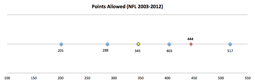
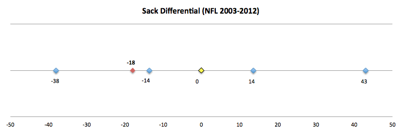
Below are several charts that each contain 6 data points. They are as follows:
Max, Min, Avg, +1 StDev, -1 StDev, and the 2012 Eagles
I’ve highlighted the 2012 Eagles in Red and the Average in Yellow. The timeframe for included data is noted at the top of each chart.
For example, here is Points Scored:

So the 2012 Eagles scored 280 Points, which is significantly worse than the time period average (345), but within 1 standard deviation (272).
Simple enough? It’s not elegant, but my hope is to create something for which I can show a lot of charts next to each other with minimal explanation. Hopefully, since they’re all formatted the same, it will be easy to visualize everything at once. I’ll list a few more below so we get a better idea of what it would look like.
In the run-up to the season, I hope to put a comprehensive set together so we can see all of last season, statistically, at a glance. Hopefully, this will also help illustrate which areas of the game we should expect significant improvement in.


Interesting? Suggestions?
———————–
Tonight is the NBA draft. Normally this isn’t that noteworthy of an event, unless the Sixers have a high lottery pick (tonight they pick 11th). However, the Sixers have a new GM, so perhaps something interesting will happen.
Most mock drafts have the Sixers taking a Big (C/PF), noting that the team “needs” help at that position. That analysis is remarkably short-sighted. Given the structure of the game (small rosters, 5 men on the court at a time, etc…), the NBA is HEAVILY dependent on “stars”. This means that NBA teams should draft BPA no matter what. It is even more important to do this in the NBA than it is in the NFL (and we’ve seen how vital it is in the NFL).
Fortunately, the new GM (Sam Hinkie), is a member of the “analytics” crowd, so surely he knows this. I don’t follow the NBA draft nearly as much as the NFL draft, so I won’t make any specific player recommendations. However, even though he hasn’t made a single move yet, I have more confidence in Hinkie than I’ve had in any Sixers GM during my lifetime (28 years). That itself is cause for optimism.
It may be time to start paying attention to the Sixers again. If you’ve tuned out the past couple years, let me catch you up on everything you NEED to know:
– Jrue Holiday is VERY good, and has a legitimate shot at being a “star”-level player.
– It is VERY difficult for the Sixers to sign marquee free agents because Pennsylvania has a state income tax (unlike Florida or Texas). It might also be because Philly is not a “warm-weather” location, but I think that aspect is largely overblown (you’ll hear it a lot from the press).
There you go, you’re caught up. The rest would just make you sad and remind you why you tuned out in the first place.

Way to jinx it with the Krueger holiday comment
So is there a reason to watch the Sixers next season? I honestly can’t name a single player worth a damn (not that I disagree with the trade. It was completely necessary given Holiday would prevent us from tanking).
And yeah… Wow the eagles sucked last year.
Im in disbelief, but only cause no GM has ever had the balls to do something like this (completely the right call).
To answer your question, the only reason to watch is to tacitly support the overall strategy. This could be an ALL-TIME bad team though, especially since Noel really shouldn’t play at all next year.
On Fri, Jun 28, 2013 at 9:42 AM, Eagles Rewind
Wow, this is by far the most painful way to look at last season I’ve seen yet. There’s no shame in being bad, but being consistently more than a standard deviation in the wrong direction is pretty damning.
Actually, thinking about it, the only way you could make it more “elegant”, as you said, would be to show the rough bell curve of the stat, and I know that would take significantly more time. (Unless Excell can do that one for you too?)
I’m not sure if that would look better or worse for the 2012 Eagles.
Excel really sucks at all things “bell-curve”, unless theres some secret I dont know about. Very unfortunate
Yeah, that was really the impetus for the dashboard idea. I get the sense the many dont appreciate just how bad the Eagles were in certain categories last year (like turnovers, fumbles lost, field position).
Fortunately, some of those categories have no persistence, so we should see at least modest (and maybe large) gains.
When I put the full dashboard together, I’m planning on including some measure of persistence and perhaps the correlation value with winning. Thats assuming everything goes to plan though.
Brent –
Thanks for all your solid data analysis… for me, it really helps take the emotional sting out of last year’s mediocrity.
Obviously I’m late to the party on this post, but one unhelpful thought I had on the dashboard is to realign the metrics in which a positive number is actually a negative (i.e., “fumbles lost” and “points allowed”) so that “bad” values always appear on the left side. That way – much like the equalizer on a dated stereo receiver – we could quickly scan across the fields to see where we’re REALLY bad historically, or surprisingly good, etc.
Another unhelpful thought along the same line, would be to give the 2012 Eagles a “red” value when they’re worse than average, and a “green” value when they’re better.
Thanks again for all your work!