Went to the U.S. Open practice round yesterday, hence no post. Biggest takeaway? Players are going to score, but only those that avoid the rough at all costs. My wrists hurt just watching players try to get out.
Today’s chart stems from a commenter’s suggestion. I’ve graphed the offensive and defensive performance (league-average adjusted) for all NFL teams from the last ten years and highlighted the Super Bowl teams in Yellow. It’s a little tough to read, so to be clear:
The X-Axis (left-right) is OFFENSIVE performance. So the farther RIGHT a dot is, the better the OFFENSE.
The Y-Axis (up-down) is DEFENSIVE performance. The HIGHER the dot is, the better the DEFENSE is.
So the best teams are in the upper-right quadrant (the 1st if my high-school geometry memory is correct). The worst teams are in the lower-left quadrant (the third).
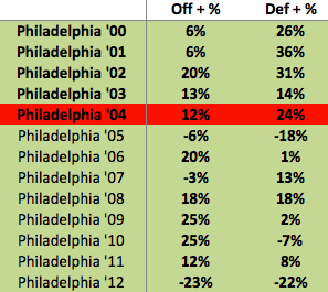
I did not label the Eagles teams, since doing so crowds the graph too much. However, below is a table showing the Eagles’ performance going back to 2000 (note the graph only goes back to 2003). The 2004 team is highlighted red because they lost in the Super Bowl.
Looking at the chart above, we can clearly see the teams that won with great offenses (Saints) and those that won with great defenses (Steelers ’08). We can also see that the 2004 Patriots were the most balanced Champion (best?) by a fairly wide margin. Also, the 2007 Patriots are the blue dot by itself on the right. In terms of regular season performance, that was easily one of the greatest professional teams ever, regardless of sport.
While comparing the Super Bowl winners above is interesting (clearly illustrates the relative strength of each team), I’d also like you to take a look at the axis scales. Notice the offensive axis (left-right) has a much higher maximum than the defensive axis.
No team in the last ten years has finished with a defense more than 40% better than league average (Points Against). Conversely, over that same time period, 11 teams have finished with an offense at least 40% better than league average (Points For). Clearly, though, a great offense does not lead to a Super Bowl win with any certainty.
If we go back to the post earlier this week. We can see the visual illustration of the necessary-condition strategy. Basically, to win a Super Bowl, you MUST be on the right side of the Y-Axis (average offense or better). The same rule does not hold for defensive performance. However, it also appears as though, for Offense, the point of diminishing returns is reached rather quickly (i.e. going from -5% to 5% has a much greater effect on winning than going from 40% to 50%.)
Lastly, here are the Eagles. I’ve listed them in (X,Y) order so you can easily place them in the graph above. Remember, Off (X) is right-left, Def (Y) is up-down.

