Ok, so a couple of weeks ago I posted about how often great QBs have bad performances. Today, let’s take a more detailed look at things. The overall question is, are quarterbacks equally likely to outperform or underperform their long-term average QB rating in any individual game? Stated differently, are the individual performance distributions symmetrical? Are they Normal?
Let’s start at the top. Here’s the graph for Peyton Manning. Note that the X-Axis labels show the UPPER Bound of each bar. So the “60” label means that bar corresponds to games where the player’s rating was between 50 and 60. Also, this is all games with at least 10 pass attempts. Remember that these are NOT weighted numbers, so they’ll be different from the career measures for each player. This helps to minimize the skew effects of games with a lot of pass attempts (garbage time yards in a blowout loss for example) as well as increase the weight of great games with relatively few attempts (when a team has a big lead early perhaps). Realistically, we just want to know what level of performance we’re likely to get in the NEXT SINGLE game.

That looks pretty Normal. The Mean is 97.45 (note that this is NOT his long-term average, since it’s not weighted by attempts). The Median is 95.6. Obviously, those are crazy-good numbers. That’s why he’s a HOFer.
Big-picture, if players generally follow a Normal distribution, then we can tell a lot about Nick Foles from relatively fewer games. So Peyton’s chart is really encouraging.
But here’s Drew Brees:

Not nearly as neat as Peyton’s. The Mean is 95.17, the median is 92.4, and there’s some clear skew to the distribution. Going back to the last post (linked above), notice that Brees has had more games with ratings between 60-80 than he has games with ratings between 80-100. Overall, his performance, though still amazing, is less predictable than Manning’s. The standard deviation of Brees’ game log is 29 (rounded) while Manning’s is 27. Illustrated differently, we can look at the range covering the middle 50% of performances:
Manning: 79.9-112.2
Brees: 72.8-116.7
Again, both great, but Brees is less predictable. We could raise some interesting strategic questions here as far as which one you want in which situation, but I’ll save that for another day. For now, just imagine tying it back to our “David Equation” (that’s what I’m calling it now). Brees might not be as good, but his higher-variance play might be preferable for an underdog team, while you’d rather have Manning if you’re the favorite.
Now let’s take a step down and look at some non-future-HOFers.
Here’s Sam Bradford:
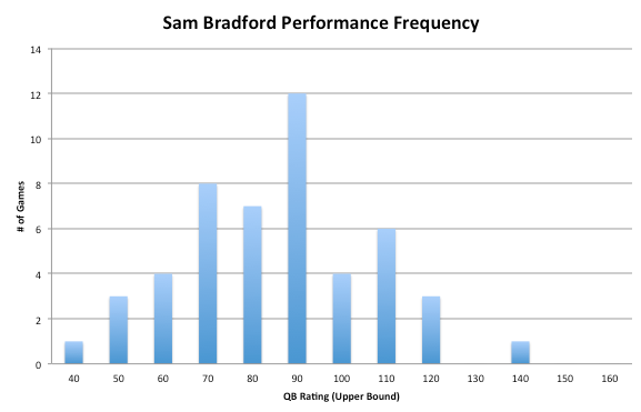
Much uglier, as expected. The mean is 80.48, the median is 81.2. The standard deviation is actually much lower than either Manning or Brees, at just 21. His middle-50% range is:
66.3 – 91.3.
That’s what a bad QB looks like. Now we should probably caveat all of this by saying it’s a bit unfair to evaluate the QBs in a vacuum, with no regard to the talent level they’re working with. That’s the case with just about every NFL evaluation, it’s just the nature of the game. Still, Bradford hasn’t been good enough, and I’m skeptical he ever will be…
How about Eli? (You knew I couldn’t leave him out)
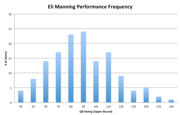
Mean of 82, Median of 81.65. Standard deviation of 27.3. Hmmm…those numbers look vaguely familiar. What were Sam Bradford’s again? (mean of 80.48, median of 81.2, stdev of 21).
Interesting. Future HOFer Eli Manning’s average a median performance are almost identical to secret-bust Sam Bradford (secret because nobody seems willing to say it outright. I will, Bradford is a bust, unequivocally. Closing in on 2000 pass attempts, he has a com % below 60 and a Rating below 80).
What about Eli’s middle-50 range? 63.6 – 100.7.
That’s just about the definition of mediocre (and maybe even a bit worse, we’ll see later).
Before I move on, let me repeat one thing.
Eli Manning’s MEDIAN performance is a rating of 81.65. So HALF of his starts are WORSE than that.
Going back to the initial question I posed: Are individual QB performance distributions symmetrical? Almost, though we have to grade it as inconclusive since I only looked at a few QBs. So we might be able to use that to infer some info about Foles. Clearly, though, they’re not Normal… There’s a lot more we can do with this type of data, but I’m going to have to wait for another day to start on it.
Also, as is usually the case, I think I stumbled onto something more interesting (the middle-50 ranges). So rather than go through each QB and post a chart of they’re distributions, I’m going to end this post now and start making a table of every starting QB’s Middle-50 range. Then we can start talking about which is “best” in a given situation, with some real data to go from.
Before I go, here’s Nick Foles. He has just 11 qualifying games, so small sample is an understatement, but it’s fun to look anyway.

Average is 97.2, median is 96.6. Standard deviation is 35.8.
And here’s Mike Vick.

Average is 80.9, Median is 83.6. That’s 2 points BETTER than Eli’s median performance…. Vick’s standard deviation is 28.6.
Happy Thanksgiving

Never apologies for bashing Eli. Imo an underrated potential HOF candidate is Romo. If he has a few more years like this, his overall numbers stack up well with other elite QBs.
Romo is much better than most people think…
On Fri, Nov 29, 2013 at 1:16 PM, Eagles Rewind
yea, I honestly think Eli is the most overrated QB and Romo might be the most underrated.
This list is very telling imo (I used 400 attempts to get Foles on it)
http://tinyurl.com/kqrc5wq (using tinyurl because the PFR link was 930 chars)
Nice work investigating the actual distributions, which are often much more enlightening than just the mean or the mean and standard deviation! In case you’re not familiar with it, a neat way to visualize percentiles of a distribution is a box and whisker plot: http://en.wikipedia.org/wiki/Box_plot. If you’re already tabulating data on the middle 50%, perhaps it wouldn’t be too hard to whip up a nice plot of that type for easy QB comparison.
Thanks. That’s the next move. I did them for my draft rankings, so I’ll use the same format once I have the data. I think it’s a much better way to compare players than just looking at Rating. Variance is something that’s not talked about enough as it pertains to individual ability. Once I get the box-plot up, we’ll be able to see who the high-variance guys are. Hopefully we’ll see something interesting.
On Fri, Nov 29, 2013 at 5:20 PM, Eagles Rewind
This is an excellent post, and directly answers one of my questions from your prior post. I can’t tell you how happy I am to see the words “frequency distribution” in the context of Eagles analysis. Great work.