Eagles Offensive Evolution

As you might have expected after Wednesday’s post, I have also put a chart together that illustrates the Eagles Offense’s evolution in personnel over the Andy Reid era.  Rather than doing a pure positional chart like before (I may still put that together for the offense), I decided to illustrate the Top 5 players from each year (by yards from scrimmage).

This gives us a better idea of the general focus of the offense each season, as well as showing the ebb and flow of each player’s career with the Eagles.  Below is the chart.  Please note that the only data included is for years in which the subject player ranked in the top 5 of yards from scrimmage for the Eagles.  So if a player either doesn’t feature on the chart or has a year for which they are listed at 0 yards, it just means they didn’t rank in the top 5 of the team that year, not that they recorded 0 yards that year.  Also, this highlights rushing and receiving yards, so QBs are not represented beyond their rushing contributions.  Click to enlarge.

Screen Shot 2013-05-17 at 10.57.15 AM

I know that’s not the easiest chart to read, so I labeled the major contributors.  In general, as the chart moves from left to right, the legend (right) moves from the bottom to the top.  Additionally, here is the data:
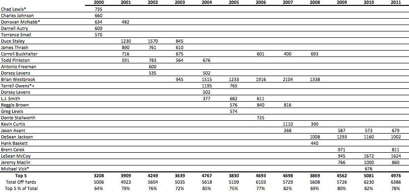
Screen Shot 2013-05-17 at 11.03.08 AM

Takeaways:

– Overall, we can see the gradual increase in total yards for the top 5 offensive players.  As I illustrated last week, the Eagles offense improved over Andy Reid’s tenure, and not just as a result of overall league offensive inflation.

– The increase in overall yards coincides with an increase in the % of Total (seen at the bottom of the data table).  This shows how the Eagles offense became more “playmaker” focused.  In Andy Reid’s first few years, the distribution of offensive yards and touches was more widespread than in his later years.  Obviously, the early years’ offenses did not include anywhere near the same level of skill as the later years’.

– Brian Westbrook jumps out immediately, and clearly held the largest non-QB offensive share during the Andy Reid era.  Notably, LeSean McCoy looks like he had the potential to match Westbrook’s contributions, if Andy had continued to coach the team.  It always bothered me that Andy didn’t feature Shady in the same way he did Westbrook.  Part of that is because the Eagles now have DeSean and Maclin, and part is due to the fact the Shady is not as good a receiver as Westbrook was.

However, I would like to see Shady used as a receiver more often, and not just on designed screens or check-downs.

– As I already mentioned, the chart highlights the clear improvement in offensive talent over the course of the Andy Reid era.  The main early contributors were James Thrash, Duce Staley, and Todd Pinkston; the late ones Shady, Jackson, and Maclin, with Westbrook in the middle.

Note though, that the Eagles best years under Reid featured Duce Staley as the biggest offensive weapon (outside of McNabb).

– The chart also illustrates the relative cameos made by random players like Dorsey Levens, Donte Stallworth, Antonio Freeman, Hank Baskett, and Greg Lewis.  Remember them?  They each had at one season in which they were a “top 5” offensive weapon for the Eagles.

– 2008 stands out as a major transition year for the offense;  before then Westbrook was THE weapon, while after marked the fast transition to the current Eagles offensive era.

– At the moment, I expect the Chip Kelly era to bring more equality to the offensive yards distribution.  That’s obviously speculative, but I believe we will see the “Top 5% of total” decline over the next year or two.

Roster Evolution of the Eagles Defense

As I illustrated earlier this week, the Eagles’ defense under Andy Reid was MUCH stronger from 2000-2004 than it was thereafter.  As a reminder, here is the team’s Points Allowed performance from 2000-2012.  The “LAVG-PPGA” shows how many FEWER points per game than the league average the Eagles allowed that year.  So for the 2000 season, the Eagles allowed 5.4 points per game less than the league average.  The “Def+%” shows that margin divided by the league average, which gives us the percentage difference (which accounts for the offensive inflation over the years).

Screen Shot 2013-05-15 at 11.50.38 AM

So the question is, what happened after 2004?  While the Jim Johnson effect can be clearly seen after his departure after the 2008 season, that doesn’t explain the team’s performance in 2005 and 2006.

Was this just bad luck?  Something else?

Well to begin to answer that question, I felt like it’d be useful to take a look at how the defensive personnel evolved over time.  To do that, I prepared a graphic that shows the Eagles defensive starters for all even years from 2002-2010 (5 seasons).  Additionally, I listed (in parenthesis) each player’s Approximate Value for that season as defined by Pro-Football-reference.com.  Note that this is a far from perfect measure, especially on the defensive side of the ball, but it gives us a good idea of who the biggest contributors were each year.  Players with an AV of 6 of below are shown as Red.  An AV of 7-9 is Yellow, with 10+ getting green.  For quick reference, the top two circles on each line (2002 and 2004) mark the “peak” era.  Click to enlarge if you can’t read it as is.

Screen Shot 2013-05-15 at 11.48.26 AM

So what can we see?

Unfortunately, it doesn’t present as clear an answer as I had hoped.  However, if you look closely, I think you can begin to see a potential factor; namely, the Elite players.

While I won’t go into overall football philosophy here (that’s its own post), in general, I am of the belief that you SCORE points with scheme, and PREVENT them with talent.

Now that’s an overly simplistic description, and obviously you need talent to score and a good scheme to prevent points, but at a high level, that’s how things shake out (mostly due to the offense’s inherent knowledge advantage, in that they know the play and the defense doesn’t).

How can we apply that here?

Well as you can see, the “peak” Eagles defense’ all included truly Elite player performances.

From 2000-2004, you’ve got Troy Vincent, Hugh Douglas, Brian Dawkins, Lito Sheppard, and Jeremiah Trotter (not shown since his best years came in ODD years) all turning in truly Elite performances (not necessarily every year).  When those players were in their prime, they were easily among the best at their positions in the entire league.

The failure to replace these players with others of similar skill is one of the BIGGEST FAILINGS of the Andy Reid FO regime.

As you can see above, after 2004 (so the bottom three circles on each position line), the best Eagles defenders were Trent Cole, Asante Samuel, Quintin Mikell, and Brian Dawkins (though below his peak).  While each of those players was very good, they really did not come close to matching the peak years of the 2000-2004 players I highlighted above.

So what now?

Well it’s clear the Eagles’ current defense needs more top-end talent.  As of this moment, the only player that looks like he has the ability to become “elite” is Fletcher Cox.  As I just showed, that’s not nearly enough.  Unfortunately, it looks very unlikely that this year’s draft produced any more potential impact players for the defense.  While I admire and support sticking 100% to BPA (my definition, not the NFL’s…see TPR), at some point, the Eagles will have to find impact contributors on defense.  Ideally, next year’s BPA at each spot will be a defensive player.  If not, though, the Eagles will have to move around to ensure that’s the case.

The Best Offenses and Defenses since 2000

Today I’ll continue in the same vein as yesterday’s post, this time broadening our scope to include the entire league, rather than focusing on just the Eagles.

First, however, I have to acknowledge the news yesterday that Donovan McNabb will be retiring as an Eagle in the fall (looks like it will likely happen before the KC game so Andy is there).  Objectively speaking, McNabb was a fantastic QB who every Eagles fan should love.  I’m not going to go through his numbers today, but it’s safe to say he’s one of the more under-appreciated stars of the league, due entirely to the lack of a Super Bowl ring.

The NFL, more than any other league (thought the NBA is close), judges its best players (QBs) almost entirely on Championship performance.  In my opinion, that’s ridiculous; but it is what it is.  If McNabb takes home that SB ring (he was damn close), both he and Andy become true sports royalty in Philadelphia.

Although I typically stay far away from any conspiracy theory, you will never convince me that the Patriots didn’t cheat in the Super Bowl.  While that is a subject for another day, given when/how they were found out and the subsequent destruction of the evidence (shady and inexcusable), there is strong logical support for the Super Bowl cheating theory. If that doesn’t happen, McNabb is a HOFer.

We should all treat him as such anyway.

Back to the stats.

Now let’s take a look back at the league, starting with the 2000 season.  Yesterday, in an effort to discern just how good each Eagles offense and defense was, I measured every team against the rest of the league from that year, presenting the results in a +- % format.

Two caveats before we get to the best defenses.  One, the league averages INCLUDE each subject team; so the historically great teams, in fact, outperformed the league by slightly more than what is shown below.  Two, I did not go through every team’s season to see if they “shut it down” after clinching a playoff berth.  Some likely did, which would have an effect (relatively small) on the subsequent rankings.

Also, what we are looking at here is Points Allowed.  This is a little different from looking at the “best defenses”, so perhaps it’s fairer to say we are ranking the best “team point prevention seasons”.

So which teams had the best point-prevention seasons?  Here is a table of the top 25 since the 2000 season.  Teams highlighted yellow won the Super Bowl.

Screen Shot 2013-05-14 at 11.17.27 AM

The 4th column above “LAVG-PPGA” just shows the point margin for each team above (actually below in this case) the league average.

As we can see, there’s a lot of yellow (SB champs) and a lot of Green (Eagles), but no overlap..

  • The 2000 Baltimore defense, which we all knew was great, was a full 50% better than the rest of the league.  As I mentioned above, if we remove the Ravens from the league average that year, their performance would be even better, breaking the +50% mark.
  • The Buccaneers team that beat the Eagles in the NFC title game was a HISTORICALLY great defensive team.  There was a lot of hand-wringing in Philly after the game about how inept the offense was (particularly the receivers), but the simple fact is, the Eagles ran into a figurative defensive wall.  One almost as strong as that famed Baltimore defense mentioned above.
  • Also of interest is the placement of Green Bay ’10.  While Aaron Rodgers gets a lot of credit (as he should), the strength of that team was really the defense.
  • It might also be strange to see New England featured twice on the list (including the ’03 SB team), but the early Belichick era was really built on that side of the ball.  Notably, despite all their regular season success, the Patriots last SB win came in ’05, during their “defensive” era, as opposed to the “offensive” era we’ve seen from them more recently.  To be fair, the “offensive” Patriots did GET TO the SB twice, losing close games to the Giants in each.

How about the Offenses?

As I did with the defense, here I am looking purely at Points Scored.  The same caveats apply.  The only thing I’ve added is Red highlighting for Super Bowl LOSERS.

Screen Shot 2013-05-14 at 11.37.20 AM

While we didn’t need this table to tell us the 2007 Patriots were a great offense, it really is incredible just how much better than everyone else they were.  Even accounting for points inflation, no team since 2000 (and I’d be surprised if any team in modern history) comes close.  The 2000 Rams were also an amazing offense, 63% better than league average, and yet that team is still 7% below the 2007 Patriots mark.

  • Perhaps most surprising here is the lack of yellow (i.e. Super Bowl Winners).  As I’ve explained before, it is NECESSARY to have an above-average offense if you want to win the Super Bowl.  HOWEVER, a truly GREAT offense guarantees you nothing.  Contrast this chart (1 winner in the top 25) with the Defense chart above (5 winners in the top 25), and it looks like, all other things being equal, having a Great defense trumps having a Great offense.
  • The Eagles, obviously, do not appear on this list.  For all of Andy Reid’s offensive skill (and he has a lot), that never translated to a truly great offense.  Looking at yesterday’s tables, the Eagles never really came that close either.
  • Again, the Patriots “offensive” era shows up a lot here, though it hasn’t translated to more Super Bowl wins.
  • Lastly, there are a couple of surprising teams that people might have forgotten about:

               Kansas City ’02-’04: Trent Green and Priest Holmes

               Oakland ’00: Rich Gannon and Tim Brown

               Minnesota ’09: Favre and AP (Ok, you probably didn’t forget about them)

               Denver ’00: Brian Griese and Mike Anderson (Wow…)

Andy Reid’s Best: Adjusting for League Average

Last week I showed a couple of tables that illustrated the relative performance of each Eagles team under Andy Reid (other than his first year).  To do that, I compared the PPG and Points Allowed Per Game to EVERY other team from the past 10 years.  The results were interesting, and showed that the Eagles typically performed very well in at least one of those categories; but also showed that while offensive performance trended up over time, the defense fell off by a larger amount.

The problem, though, is that the analysis did not take into account the annual league-wide scoring fluctuations, and specifically, the general increase in scoring over the past 13 years.  I’ve done a similar analysis today, but this one shows how each team performed relative to the rest of the league FOR THAT YEAR.

Before I get to the charts, here’s an example of what I did (it’s very simple):

The 2002 Eagles scored 25.9 PPG.  The NFL average that year was 21.7.  

The Eagles scored 4.2 PPG more than the league average or 20% (4.2/21.7).

The tables below will show the % over or under league average for each Eagles team.

First, the Eagles Offense:

Screen Shot 2013-05-13 at 10.37.45 AM

As we can see above, after his first year, Andy Reid’s offense only finished below-average 3 times, with 2012 marking the only really poor performance.  Interestingly, the best offensive years for the Eagles were in 2009 and 2010, when the team was 25% better than the league average.

The 2004 Eagles team, the Super Bowl team, was just 12% better than league average.  However, that team (after clinching) shut it down for the last two games of the season, scoring a combined 17 points in losses against the Rams and Bengals.  If we remove those two games, the 2004 Eagles averaged 26.4 PPG, or 22.5% better than league average.    While that is a very strong performance, it still doesn’t rank better than the ’09 or ’10 teams, and is just above ’02 and ’06 teams.

Taking a step back, we can compare the “Andy Reid Peak” to the rest of his tenure and get an idea of how things changed.  For this, I’m going to ignore last season, since it was a clear outlier.

Andy Reid Peak (’00-’04) – The Offense averaged 2.4 PPG more than the league average.

After Peak (’05-’11) – The Offense averaged 2.8 PPG more than the league average.

Or put differently, during The Peak the offense, on average, was 11% better than league average.  After the Peak, the offense was 13% better than league average.

So over time, the Eagles’ offense got better (which we knew from last week), but by a relatively small margin.

Now let’s look at the defense:

Screen Shot 2013-05-13 at 10.52.08 AM

This table shows a much clearer break between the “peak” and “after-peak”.  Four of Andy Reid’s best defensive performances (and 5 of the top 6) came during the 5 seasons “Peak” stretch.  During this time, the Eagles defense allowed an average of 5.5 FEWER PPG THAN LEAGUE AVERAGE.  That’s a truly amazing run of performance.  On a percentage basis, the team was, on average, 26% better than the league-wide average.

After the peak, the Eagles allowed an average of 0.5 fewer points per game (2%) than the league average, which means the Eagles went from being a historically great defense (from ’00-’04) to being an average one.

Here is a table showing the performance of both the offense and defense side-by-side, and a graph showing the performance of each over time:

Screen Shot 2013-05-13 at 10.58.36 AM

Screen Shot 2013-05-13 at 11.02.24 AM

Here is another chart, which hopefully provides a clear illustration of the overall performance trend for both the offense and defense.

Screen Shot 2013-05-13 at 11.06.44 AM

This chart provides the clearest picture yet of the overall shift in team performance as time passed.  While it’s not as easy to see as I had hoped, the slope of the defensive line (red) is much larger (absolute value) than the offensive line (blue).  That means the team’s offensive gains were MORE than offset by corresponding drops in defensive performance.

Tomorrow I’ll show you how the best offenses and defenses since 2000 and how they stack up when adjusted for league average.  Hint: the 2007 Patriots were OUTRAGEOUSLY good on offense (which we knew), but so were the 2000 Rams (who everyone remembers but forgets just how dominant that offense was).

More on the Eagles “Andy Reid Peak”

UPDATE: For those wondering, next week I’ll post the same stats adjusted by annual league average.  Similar story, but it clears up some of the inflation and year-to-year comparison issues.

First, you’ll notice the site looks a bit different today.  I’ve been meaning to change it for a while; hopefully this is easier to read.  I’m not happy with the entire layout, so you may notice more changes soon.  In any case, if it’s not an improvement, please let me know.

Now then, where were we?

Right, the Andy Reid Peak, which ended after the 2004 season…

Below is a table showing the top 30 best defenses (lowest PPG allowed) in my data set.  Remember, the data set is the last 10 seasons (320 teams) PLUS the 2000-2002 Eagles teams, for a total of 323 teams.  In the table, I’ve highlighted the Eagles in green.  Also, I’ve highlighted Super Bowl Champions in yellow.

Screen Shot 2013-05-10 at 11.34.09 AM

These are, roughly, the top 10% of all defenses.  Note that I have not included the rest of the league for the 2000-2002 seasons (not as easy as you’d think, for reasons I won’t explain here).  If I had, I believe there’d be 5-6 defenses that rank above the 2004 Eagles in this chart (including the outrageous 2000 Ravens, who allowed just 10.3 PPG).

In any case, including those years would actually IMPROVE the Eagles percentile rank here, so the point remains: the biggest strength of the Andy Reid Peak teams was defense.  Jim Johnson was with the team through the 2008 season, so the drop-off after 2004 is not related to coaching.

I’ll go into more detail about the drop-off next week (once I’m finished looking for potential explanations).  Today, though, is just about illustrating how good the Andy Reid Eagles were at their best.

How about offense?

Andy Reid is known as an “offensive” coach, so how was his team’s performance on that side of the ball?

The Eagles’ best offensive performance (PPG) under Reid was actually in 2010 (the Vick outlier season).  That year, the team scored 27.4 PPG, good enough for 27th overall in my data set (92nd Percentile).  Note that this was NOT during the “Andy Reid Peak”.

In fact, the best Andy Reid teams featured relatively average offenses.  Below is a table showing each Eagles team from 2000-2012 (I’m ignoring Year 1 for obvious reasons).  The first column shows that team’s offensive percentile ranking within my data set.  I’ve bolded the “Peak Era” teams.

Screen Shot 2013-05-10 at 12.10.30 PMOverall, Andy’s reputation appears justified.  6 of his 13 teams here finished in the top 25% offensively.  Three more finished better than average.

However, notice that the 2001 Eagles managed to win more games than the 2010 Eagles despite scoring SIX fewer points per game.  That’s a huge difference in performance.  There was some offensive inflation across the league over this time period, but nowhere near enough to account for the degree of change we see above.

I’ll leave it there for today, since I want to focus on the positive.  Next week, we’ll take a closer look at the relative trade-offs Reid appears to have made (sacrificing defense for offense) and if we can learn anything from that about overall team construction (I touched on this in the Necessary Conditions post if you want to get a head start).

The Good Side of the Andy Reid Era

I’ve spent a lot of time talking about how bad the Eagles were last year.  I do, however, want to spend some time on the good years.  Just how good were the Andy Reid Eagles at their peak?

To figure that out, we obviously have to first decide when the “peak” was.  Which Andy Reid team was best?

The quick answer would be 2004, since that team went to the Super Bowl (and lost by a field goal to a team that may or may not have cheated).  Indeed, the 2004 Eagles were very good.  As I’ve shown, Point Differential is the best statistical indicator of team performance, and the 2004 Eagles recorded 124 more points than their opponents.  Over the past 10 years, that leaves them in the 87th %tile, meaning that team was VERY good (obviously).

Quick note:  I’ve added the 2000-2002 Eagles teams to my data set, so from now on the data will include the last 10 years PLUS those 3 Eagles teams, meaning there are 323 total team season in the set.

HOWEVER, that was not the best team performance under Andy Reid.  In fact, the Eagles surpassed that +124 mark twice during Reid’s tenure; in 2001 (+135) and 2002 (+174).

The 2002 Eagles team, with PD of +174, ranks 12th overall in the entire data set, better than 96% of all teams during that timeframe (click to enlarge).

Screen Shot 2013-05-09 at 12.33.36 PM

Additionally, the 2002 team had a TO Differential of +14, better than either the 2001 team (+9) or the 2004 Super Bowl team (+6.)

The Sack Differential points to 2002 as well, with that team registering 19 more sacks than their opponents, compared to +10 for the 2004 team and +5 for 2001.

This is a long way of saying that the 2002 Eagles team was, in my opinion (though largely supported by the data), the “best” of the Andy Reid era.  Also, it’s pretty clear that the Eagles “peak was from 2001-2004.  That itself will not surprise anyone.

What I find most shocking is that the last year of the Andy Reid “peak” was nearly 10 years ago…


It was definitely time for a change.

Lastly, for today, I’ll leave you with the Point Differential per year for the Eagles under Reid (1999 excluded).  As you can see, there’s a pretty definitive down-trend over nearly the entire timeframe.Screen Shot 2013-05-09 at 12.40.15 PM


As I mentioned at the top, I’m going to spend some time illustrating how GOOD those Eagles teams were (2001-2004).  Additionally, I’ll be looking for potential causes of the long-term decline in team performance.

Fun with Charts

No great insights today, but I will give you a few charts to look at.  After yesterday’s post, I decided to go through and chart the Eagles’ performance over the last 10 years with several different statistics.  Each chart tells a piece of the “Andy Reid Era” story, some of which we’ve covered, some of which we haven’t.

First up is the defensive performance.  By that, I mean Points Against.  There are a number of variable that go into defensive performance, so summarizing it with just Points Against is incomplete, but nonetheless, it’s an interesting chart.  This chart has 2 axes (is that the plural of axis?), with Wins on the left and PA on the right.  Wins are the blue line.

Screen Shot 2013-05-08 at 11.24.53 AM
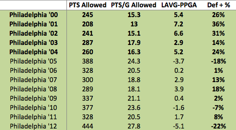
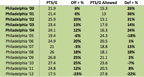
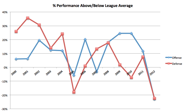
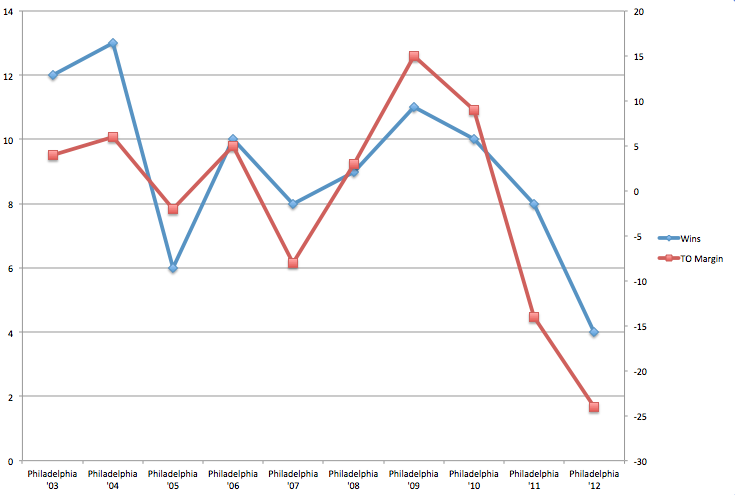
Given what we know about the correlation between Point Differential and Wins, we should expect to see something resembling an inverse relationship here (i.e. PA goes up = Wins go down).  We do see some of that, but from ’06-’09 that relationship doesn’t hold.  The biggest takeaway here is just how bad (and anomalous) last year’s performance was.  From 2003 to 20011, the average Points Against for the Eagles was just 20.11, with a high of 24.3 in 2005.  Last year the team allowed 27.8 points per game, more than a full touchdown per game over the long-term average.

UPDATE: I added the same chart below, but reversed the secondary Axis to make it a bit easier to read (thanks to a commenter).  Here, we should see a positive relationship.  Again the takeaway is that we see a bit more deviation than we’d expect, especially from ’06-’09 (and from 2010-2011).Screen Shot 2013-05-08 at 12.41.28 PM

How about Points For (Wins are the blue line again):

Screen Shot 2013-05-08 at 11.39.34 AM

Here the relationship we expect to see (positive), is much clearer and more consistent.  While they are both strongly correlated with winning, Points For/Wins is, in fact, the stronger relationship.

This should be somewhat encouraging to Eagles fans, since Chip Kelly is an “offensive” coach, and the team used its top draft choices on that side of the ball.

Remember, based on the last 10 years, having an above average offense is a NECESSARY condition for winning the Super Bowl.  Having an above-average defense IS NOT.

Here is a slightly different chart.  This shows annual turnovers forced and surrendered.  Screen Shot 2013-05-08 at 11.49.35 AM

As I covered yesterday, the 2011 and 2012 Eagles performed far worse than the team’s long term average.  Last year, in particular, reflects significant outliers for both measures (negatively), which led to the historically bad TO Differential.

Speaking of TO Differential (I know I’ve spent a lot of time on it), here is the histogram for all teams from 2003-2012.  The red bar is where the 2012 Eagles are located.  I may have run this chart before, but it’s ridiculous, so I’m doing it again.  Remember, the whole sample includes 320 seasons.  The height of each bar (the Y-Axis) represents how many teams finished a season with that TO Differential.Screen Shot 2013-05-08 at 12.12.19 PM

Click to enlarge.  That’s what I mean when I say historically bad.

Now that I’ve figured out how to do reasonable histograms in the new Excel (Microsoft took away the statistics tools), I hope to make a few more that will provide a good visual illustration of just how bad/good the Eagles of 2012 were.  I’ll also run them for Andy Reid’s better years, which will give us an idea of just how good the team was when it “peaked”.

Revisiting 2011: Andy Reid’s Downfall

I’ve spent a lot of time over the past few months examining just what went wrong last year. I’ve come to the conclusion that while the team was certainly not very good, it was also the victim of bad luck.  It is unfortunate then, that Andy Reid lost his job here at least partially as the result of circumstances which, in general, are extremely unlikely to occur.

However, it would be incomplete to say that Reid was fired purely as a result of last year’s 4 win season.  The larger issue is that the 2012 performance followed a season that saw the team win just 8 games.  These consecutive sub-par performances, together with the lack of playoff wins, ultimately led Lurie to go in a different direction.

Therefore, when discussing the end of the Andy Reid Era we must also look at the 2011 season.

Why did the team win just 8 games?  Was that a result of bad luck or was it close to the “true win value” of the team?

As you can probably guess, I’ve found some interesting statistical tidbits that I hadn’t picked up on before.

Let’s start with Point Differential.  As we know, Point Differential is the best determination of “true win value”. For obvious reason, Points Scored – Points Against correlates extremely well with Wins (.91 value).

In 2011, the Eagles’ Point Differential was +68.  Let’s look at that in a chart with every other team from the past 10 years.  Screen Shot 2013-05-07 at 11.46.53 AM

Above, we see Point Differential on the Y-axis and Wins on the X-axis.  The black line illustrates the expected win total for each Point Differential.  I’ve highlighted the 2011 Eagles in red.

While the 2011 Eagles are clearly not an outlier, the chart shows that typically, a +68 point team would be expected to win 10 games (which would have put the team in the playoffs). Instead, the Eagles won just 8 games, setting the team up for a true make-or-break season (in which it broke, to put it lightly).

Now let’s look at Sack Differential

Intrigued, I looked at a few more stats from the 2011 season and found another relatively surprising measure.  The Eagles registered a Sack Differential of +18.  As I explained before, Sack Differential (Sacks – Sacks Against) is strongly correlated with winning (.61 value).

Here is the chart:Screen Shot 2013-05-07 at 12.07.20 PM


As you can see, the Eagles are again featured well above the “expected win” line.  In fact, over the past 10 years, NO TEAM has registered a sack differential of greater than +18 and won FEWER than 8 games.  Just 1 team won 8 games with a greater sack differential (’06 Green Bay).

Now, of course, Sack Differential and Point Differential are connected.  These are not completely independent variables, so it is not that big of a surprise that the Eagles underperformed their “expected win value” in both charts.

Still, it’s interesting that in both charts, the Eagles are close the edge of each distribution range.

So what went wrong?

As you can probably guess, it was the Turnovers.  I should note that I haven’t gone through each game of the 2011 season and highlighted where each loss came from.  This is purely a 10,000 foot statistical view of the whole season.  The Eagles registered a TO differential of -14.  TO Differential is also highly correlated with Wins, with a slightly higher value of .64.

Here is the chart:Screen Shot 2013-05-07 at 12.28.53 PM

Here is where the team gave back the advantage it gained in the perviously examined statistics.  Using just this statistic, we would expect a -14 TO Differential to equate to a roughly 1 win team.

Similarly to this past season, the Eagles just turned the ball over too often.

From 2003-2010, the Eagles average TO Differential was +8.  They followed up that era of strong performance with consecutive years of -14 and -24.  Whereas last year the culprit was fumbles (lost 22 of them), in 2011 it was interceptions (threw 25 of them).

Just for fun, here is a chart of the Eagles performance from 2003-2012, with Wins and TO Differential illustrated.  The left Y-axis is Wins (Blue), the right is TO Differential (Red).Screen Shot 2013-05-07 at 12.41.08 PM


It should also be noted that 2010-2012 was the “Michael Vick Era”, though obviously Nick Foles has some responsibility for last year as well.  For all his faults, Donovan McNabb was EXCELLENT at taking care of the football.  The guy just did not throw interceptions (look at his rate, not totals).

While Vick put it all together in 2010, it’s possible that he just significantly outperformed his long-term skill level.

For all of Andy Reid’s reported “QB Expertise”, it looks as though a big part of his downfall was not finding another starter after McNabb declined.

Draft Recap part 5: Positional Breakdown

I am returning to the draft discussion today, because I believe there is still useful information to be gleaned from the event.  Today, we’re throwing positional impact away and focusing purely on the order that players were drafted and how they compared to others within their position group.

Before we get started, I want to refer us back to last year so you can get a sense of why this type of analysis is useful.  It’s too early to judge last year’s draft class, but we definitely have a sense of each player and what the draft order would be if it was re-done with current information.  Here, for example, are the top DTs from last year:Screen Shot 2013-05-06 at 11.17.50 AM

The “reach” measure is the same thing we looked at last week; a negative number there means the player was chosen EARLIER than “expected”.  However, I want you to look at the “Pos % Score” column.  Within the TPR model, each position has a different “maximum score” depending on the impact values I derive from the salary cap data.  This

“Pos % Score” column tells us what percent of that “max score” each prospect attained.  Basically, it’s an easy way to back out the positional impact adjustments and focus purely on the question “how good is this prospect?”.

There are a couple quick caveats.  I don’t have the NFP ratings from last year, so those don’t figure into the scores.  The TPR model does not account for “fit” or “role”, so a NT and a 4-3 DT will be compared against each other.  However, since all we are trying to do is identify the “best potential player(s)”, regardless of role, I’m not too worried about either of those.  In the future, I will try to increase the positional resolution of the model (I did so this year by splitting OLBs and MLBs) to better account for the “role/fit” issues.

Looking at the chart above, we can see that Fletcher Cox graded out as the best DT prospect, yet he was chosen AFTER Dontari Poe.  At this moment, it looks like that was a big mistake by the Chiefs.  Also note the very low rating for Derek Wolfe, who had a very weak rookie year.

Now here is a chart of the OLBs:Screen Shot 2013-05-06 at 11.29.08 AM

Notice Lavonte David rated significantly higher than the 3 LBs chosen before him, and his rookie season bears that rating out.

Here are a couple more positions from last year, then I’ll move to this year. Notice both the order and absolute difference between players’ Pos % scores:Screen Shot 2013-05-06 at 11.35.00 AM

Above, we see the Brandon Weeden received an almost identical score as Brock Osweiler, but was taken 35 picks earlier.  Also, we can clearly see the “tier” separation between prospects.

Screen Shot 2013-05-06 at 11.35.52 AM

In this WR chart, compare Rueben Randle’s rating with that of either A.J. Jenkins or Brian Quick.  While 49ers fans were probably surprised Jenkins couldn’t get on the field, this chart suggests he was drafted ahead of better prospects.

Ok, you get it.  What about this year?

Lets start with the CBs.  Please note that the only players I included are those that made the original TPR top 137:

Screen Shot 2013-05-06 at 11.45.57 AM

As you can see, there is some serious deviation from the pre-draft rankings.  Darius Slay, in particular, looks like he was chosen too high, since both Banks and Taylor carry SIGNIFICANTLY higher grades.  Obviously, these are not full-proof, but as we saw above they suggest the Lions (Slay) might have made a costly mistake.

Screen Shot 2013-05-06 at 11.51.58 AM

Here we have the DEs, and the variation is not nearly as severe as in the CB group.  The only one who really jumps out is Margus Hunt, drafted above Damontre Moore.  Hunt is a very high-risk/high-reward player, but note that the TPR rankings suggest this difference was due to Moore falling rather than Hunt being “reached” for.  In fact, Hunt was drafted exactly where the TPR system rated him.  Moore, however, fell 40 spots.  William Gholston, near the bottom, looks to be a bit of a steal, especially compared to Alex Okafor, but since his grade is just 71.7%, he doesn’t project to be an impact player anyway.

Screen Shot 2013-05-06 at 11.55.26 AMThe DTs are notable for their surprising LACK of deviation.  Jesse Williams “fell” a lot, but as I said last week, that’s due to injury concerns and likely reflects a medical risk that can’t be quantified.  Bennie Logan, unfortunately, rates as the biggest “reach” of the group, but note that his positional score is fairly close to the DTs drafted after him, meaning within the position group, he wasn’t a terrible pick.  This would seem to suggest that the Eagles, despite their claim to draft pure “value”, likely made this pick based on “need”.

Screen Shot 2013-05-06 at 11.58.31 AMLooking at the Guard position, we see evidence of the Bears’ perplexing draft strategy.  While Kyle Long “projects” as a potential OT in the future, this suggests that regardless of position, Larry Warford is much more likely to be a good player.  The fact that he was also available more than 40 picks later is more damning evidence against the Bears’ perceived “value” in this draft.  Again, Kyle Long might become a great player, all I’m saying is that the odds of that happening are less than the odds of Warford becoming a big contributor.

Screen Shot 2013-05-06 at 12.01.25 PMAt the OT position, we can see why the Fisher/Joeckel/Johnson triumvirate was so sought after.  Those three players represent the clear “top tier” at the OT position this year.  Nothing to note after that, as the OTs were drafted in almost the exact order they “should” have been.  However, we do see a big value difference if we look at DJ Fluker and Menelik Watson.  While both players graded out similarly, Watson was taken 29 picks later, meaning he was a significantly better “value”.

Screen Shot 2013-05-06 at 12.11.54 PMNot too much to say here that hasn’t already been said.  Mike Glennon is a very peculiar choice, but EJ Manuel represents the biggest risk.  Either Manuel was rated by several teams to be the only QB worth a 1st round pick, or the Buffalo Bills were bluffed into making a poor decision.  With a GM of questionable judgement and a rookie head coach, it’s likely they just screwed up.

This chart also throws the breaks on the Barkley hype.  Again, the story with Barkley is “great value”, NOT “great QB”.  His score is OK, but nothing special.  FOr reference, it’s roughly equal to Brandon Weeden and Brock Osweiler from last year (though notably it’s much higher than Nick Foles’).

Screen Shot 2013-05-06 at 12.17.10 PMHere are the TEs, and they tell a similar story as the DTs (as far as Eagles fans are concerned).  I have Ertz rated as a slight reach, but within the TE class, he was picked where he should have been (though Escobar is clearly the better value).

Without comment, below are some other positions.  In general, it’s important to remember the larger point here.  When a team “reaches” for someone, they are essentially saying “My evaluation of this kid is better than everyone else’s (or almost everyone)”, usually, they’re wrong.

Screen Shot 2013-05-06 at 12.19.26 PM

Screen Shot 2013-05-06 at 12.22.50 PM

Screen Shot 2013-05-06 at 12.23.22 PM

Screen Shot 2013-05-06 at 12.23.59 PM


Draft Recap Part 4: Potential “Steals”

Today I’ll cover the players that “fell” in the draft and see if we can identify any potential “steals”.  However, I want to start by doing something I should have done yesterday.  I have ESPN ratings and NFL.com ratings for several past years (I do not have NFP ratings or NFL.com ratings for 2011).  Therefore, I can run the TPR system through the 2010 and 2012 drafts and see if it correctly identified potential busts and steals.  I showed this analysis once before, but have since updated the model (and its more interesting now anyway).

As I explained yesterday, the model should be more successful in identifying busts than it is in identifying steals.  If a player falls dramatically, there is usually a reason for it, and one that can’t be quantified and put in our model.   However, players that go well ABOVE their TPR rankings, are usually just indications that teams did in fact “reach” for a player.  For 2010, this is what the biggest “reaches” list looks like:

Screen Shot 2013-05-02 at 10.42.23 AM

You’ll notice that, compared to this year, the “reaches” in 2010 were not nearly as significant.  Still, in the above chart, we’ve done a good job of identifying the players who were not “worth” their draft spot.  It’s not perfect, obviously, but the “bad” selections far outnumber the “good ones.

Consequently, I’m comfortable saying that when a team “reaches” for a player, rarely do they “know more” than everyone else.  In fact, the few successful cases may just be the result of luck (if you reach on enough players, a couple of them are going to work out).

Now you can go back and view yesterday’s post with a bit more evidence behind it.

The “Steals”

Unfortunately, as I mentioned above, the “steals” are not nearly as easy to identify.  For example, here is the same 2010 draft class, with the “value” picks shown:Screen Shot 2013-05-02 at 10.48.25 AM

There are definitely some players in there that qualify as “steals”.  However, they are mostly concentrated in the 8-12 region (that’s draft spots below TPR ranking).  I’m not entirely surprised.  Jimmy Clausen, for example, rates extremely high on the TPR system, due to his impact position and high consensus rating from ESPN and NFL.com.  Clearly, though, teams saw something about him that is not reflected here. They seem to have been justified (though he hasn’t been given a great chance).

So what can we learn?  I’m not sure, but perhaps we can be skeptical of anyone who fell “too far”.  That’s not as scientific as I’d like, but we have to start somewhere.  If a player fell more than a full round (30+ picks), we can assume that almost every team passed on him, meaning there’s likely something about that prospect that our model isn’t picking up.

Here is the chart for this year.  I’ve cut the sample to players drafted in the top two rounds (for reasons I explained yesterday) plus the 10 remaining players with the highest TPR rankings.Screen Shot 2013-05-02 at 10.58.07 AM

Several of these players have “health issues”.  Jesse Williams and Keenan Allen are both reported to have injuries that raised flags with most teams.  That’s obviously not what we’re after here, but if healthy, those two are pretty obvious candidates for “value”.  After reviewing the 2010 data, we should be skeptical of the other players that “fell” more than 30 places (roughly a full round).  As we saw with Jimmy Clausen, it’s likely teams saw something in Barkley, Nassib, and Wilson, that can’t be represented quantitatively.   I obviously hope they’re wrong about Barkley, but that’s probably not the case.

So where does that leave us?

I’d suggest that we focus on Arthur Brown and the players below him on the chart.

– Arthur Brown is, today, widely regarded as having been a great “value” pick.  I have no idea why he fell so far, but there have been no reports of injuries or off-field issues that I have seen.  However, pointing to him is cheating a bit, since every “draftnik” is already calling him a “steal”.

– Similar story with Sharrif Floyd.  While the TPR system did not rate him as highly as some “experts”, he was still graded a top 10 pick, and he fell 13 spots to #23.  Obvious candidate, and you didn’t need to come here to know that.

– The rest, however, I’ll take credit for, particularly those at the bottom.  Notice that Star Lotulelei, John Cyprien, Bjeorn Werner, and Cordarrelle Patterson all carry relatively high “positional scores”.  That means, ignoring of positional impact, they are good prospects.  Star, though he only “fell” 8 spots, jumps out due to his 92%+ score, but the others are clear “value” picks as well.

I was hoping Cyprien would be the Eagles #35 selection, but I was obviously not the only one who liked him (he was the first pick on day 2).

– The other players I’d point to are Jamar Taylor and Menelik Watson.  Each of them fell a significant amount (more than 20 picks), so it’s possible there are some behind-the-scenes issues with both players.  However, given the significant rankings deviation we saw throughout the draft, it’s also possible these guys were just overlooked.

Neither projects to be an “impact” player, but both have solid scores.  Additionally, both players play positions with relatively high historical “hit” rates, meaning their positional risk is less than most other players.

– Larry Warford I’m not too interested in, though Guards have a very high “hit” rate.  His positional score is relatively low, and it’s near impossible for a G to become an “impact” player anyway.  He might have a good career, but it’s going to be difficult for him to become good enough to count as a big “steal” in the draft.

– Tank Carradine is another player with injury issues.  It’s interesting, though, that he did not fall nearly as far as Williams or Allen.  That tells me he received a much better report from team doctors than the other players did.  If Tank is healthy, he can absolutely be an “impact” player.  He’s not a great fit for the Eagles, so I don’t mind passing on him, but he can also be looked at as an “impact” player that was taken in the 2nd round.  However, since the medical risk is real, even if he pans out it will be unfair to say he was a “value” pick.  Just because a player avoids the risk associated with him doesn’t mean the risk wasn’t real.

I’ll be closely tracking the progress of these players throughout next season.  While one season won’t be enough to judge each pick, we’ll likely be able to knock a few off the list one way or another.  Hopefully, after watching this class play out, we can adjust the model or create a new measure that will help us identify “steals” as easily as we’ve identified “reaches”.